WHERE AM I?
if you're reading this, you might have noticed that wyrmtunnel hasn't been updated in a hot minute. i still care quite a lot about this site, i really do, but the fact that i haven't had much drive to update it for a couple months now has been eating away at me pretty badly.
as of writing it's been more than three months since my last update. a big part of the reason for that is because neocities has an extremely annoying bug regarding uploading folders with subfolders, which forces you to upload all of those subfolders individually. this by itself was infuriating enough to dissuade me from adding gallery images one at a time, let alone doing anything more involved.
another big issue i encountered, this one on my end, was that i was just having a really rough time with certain aspects of the site. the most notable of these was that it just did not work on mobile devices, or even many devices smaller than my own. the current incarnation of wyrmtunnel was built off a template with extremely little consideration for mobile compatibility. after all, it wasn't intended to be viewed on mobile - but even so it feels kindof awkward and clunky to me in a way that i'm not sure other people even pick up on. i felt like i couldn't do anything more with it until i made myself fix that.
a while ago, my friend P over at portfiend converted their site to an SSG, or static site generator. i didn't know these existed until then. i wish i did.
for those who don't know, P has a really solid explanation of SSGs over here. in very short terms, SSGs let you make a template file with all the stuff you want to keep consistent around your site (like sidebars and headers/footers) while swapping out the main "content" with that of markdown files denoting different pages. The biggest draw here is that editing just that one template file will also automatically update every page that uses it.
this was huge. it is huge. i was able to use a javascript template to do something similar for the current navigation, knowing that i'd want to add more links in the future, but there's still been the concern that if i ever wanted to change a fundamental part of the site's layout - say, adding another sidebar - i'd have to go back and update every single page i'd made up to that point. even stuff that seemed little, like fixing a broken image url in the layout, would've been an incredibly tedious undertaking. it was exhausting just to think about.
A LITTLE BIT OF AN ASIDE
my personal sites have had an... interesting history with layout choices. a lot of this, of course, reflects my experience with html and css at the time of making them.
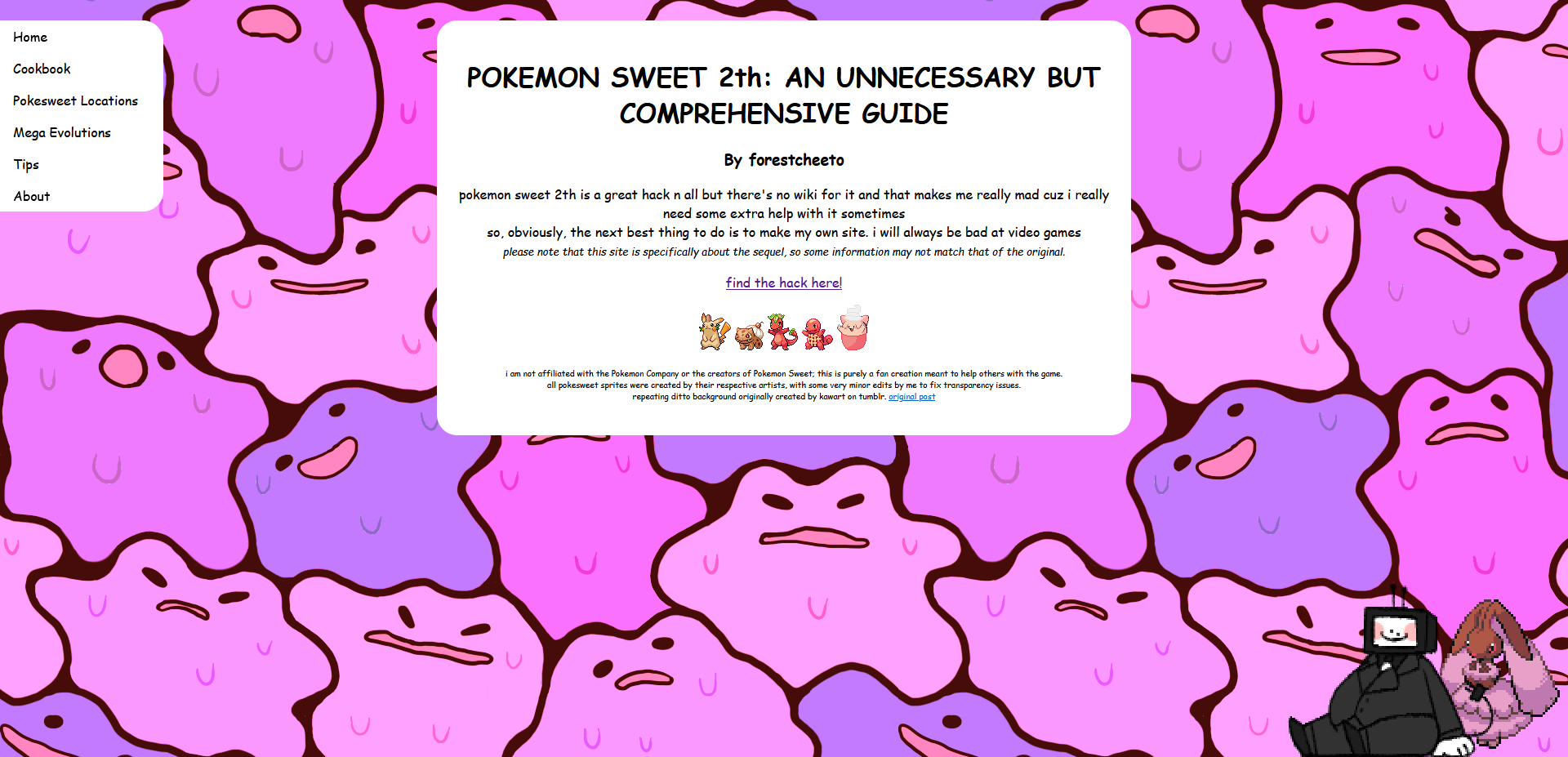
while not a personal site perse, the first one i published publicly was a half-baked guide for the pokemon fire red romhack pokemon sweet 2th.
 (byte is not part of the site, sorry.)
i made this site in february 2018. i ended up turning it in to a coding class because i did this instead of the intended assignment. i got an 80.
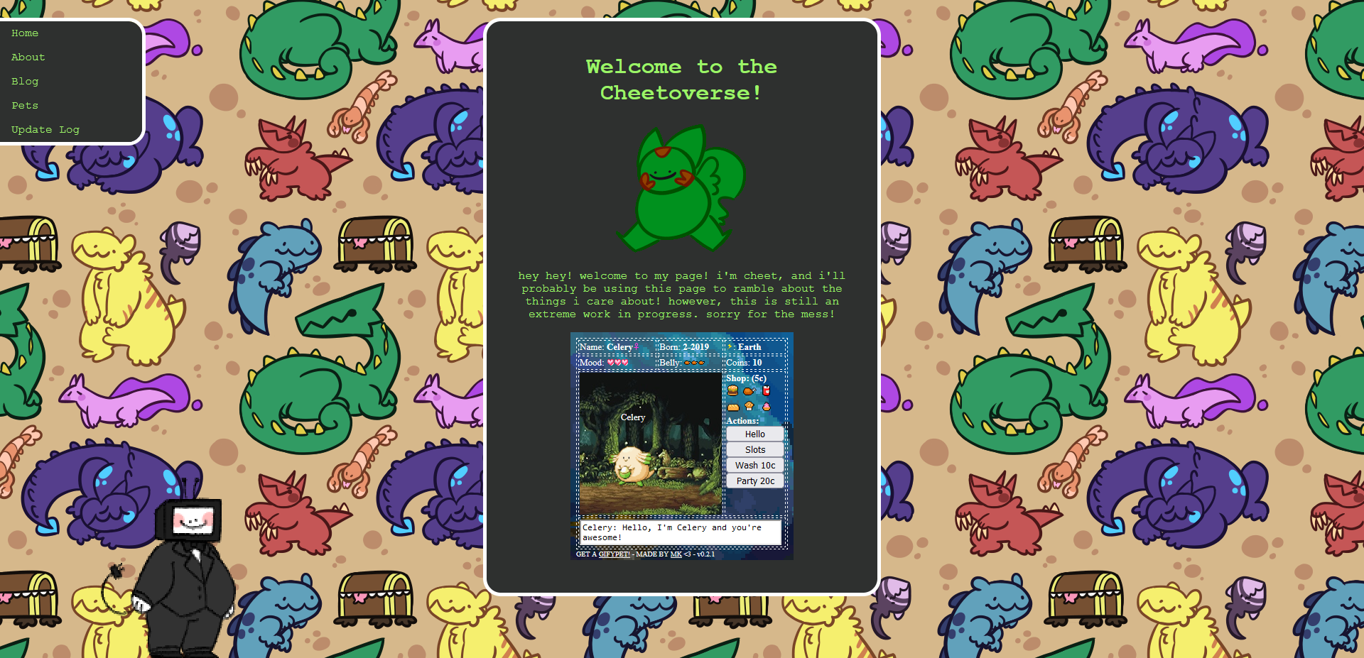
a month or so later, i adapted the same layout for use in my first actual personal site, this time hosted on neocities instead of bitballoon:
(he's not part of this one either.)
i didnt end up maintaining either of these sites for very long after the fact, and they're both pretty rough around the edges, but they do still exist. i'm not telling you where, though. not that theyre particularly hard to find, but that'd be too easy. also i kindof hate the way i spoke as a 17 year old
wyrmtunnel itself didnt come into being until september 2020. its original purpose wasn't particularly different from its current state, but the design and tone sure was. i was really hoping to have a screenshot of this incarnation as well but because it's the only one that's been overwritten or deleted out of these the closest i've come is uhm this
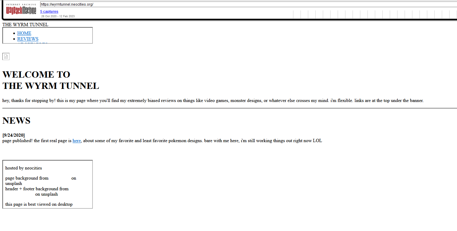
so i don't think i'm getting that any time soon. point is, change isn't anything new to me, and if anything i'm glad i've been able to expand my knowledge of web development a little bit more with each major update.
MAKING THE SWITCH
the SSG P uses is called eleventy, or 11ty. it's the one i'm using too, mostly because P's been a huge help with it so far but also because, admittedly, it's the only one i know. it looks really intimidating to get into, but i actually managed to get an extremely barebones template and page up and running in the span of about an hour:
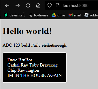
impressive, isn't it.
the rest of this process so far has been mostly recreating the look of wyrmtunnel's current iteration, and in the process refining many of its quirks and - most importantly - making it look better on smaller screens. i'm actually remaking everything from scratch, with relatively little copy-pasting from my original code. notably, i'm using flex containers for basically all of the boxes; one of my earlier attempts used CSS grids instead, but i couldn't figure out how to make those responsive. toyhouse coding has given me a lot more flexbox experience anyway, so i'm a little more aware of what i'm actually doing.
another notable change is the addition of font awesome to the new layout. this wasn't strictly necessary, of course, but i really, really like the look of it. i will Fucking die if i make a toyhouse code without using at least one font awesome icon. unlike toyhouse, though, i'm not able or willing to shell out a hundred bucks a year for their pro plan. some of the biggest losses as a result of this include fa-dinosaur, fa-teddy-bear, fa-file-heart, and the biggest tragedy by far, fa-computer-classic. it's fine though i can use free substitutes. it's fine. im telling you i can cope with this. its fine
other than that, i've been learning a lot of other supplementary stuff to make some things easier to put together - blog entry and gallery blocks are both made using macros, for example. there's still a lot i'd like to do before i can start moving stuff over proper - let alone uploading it all and calling it done - but im hoping to have it all ready by the end of the month. i think.
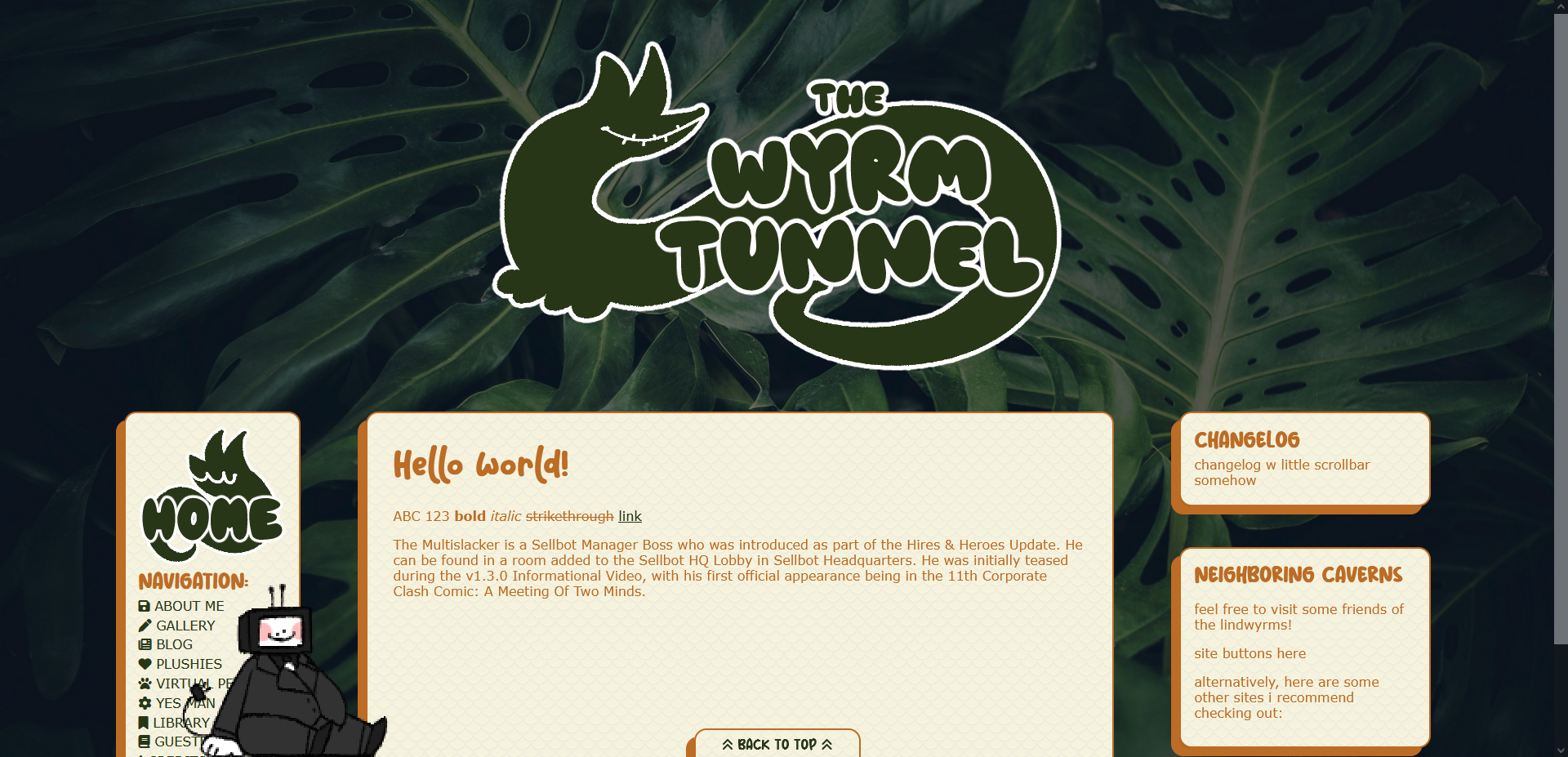
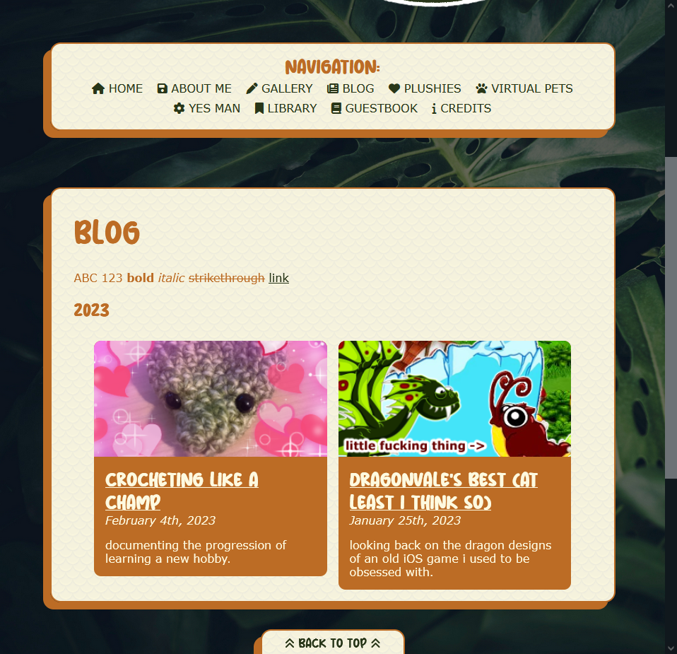
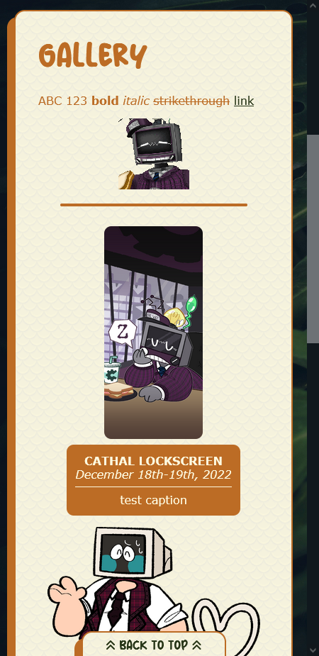
in the meantime, here's a few screenshots of my current progress:
CLOSING THOUGHTS
ok well i thought id have more to write at the end here but now i feel like im supposed to shift into essay conclusion mode and frankly i don't want to do that. uhm here's a video i really like of a doom wad that made me scared